Claude has a new feature called Design.
Claude Design is a research preview launched by Anthropic on April 17, part of the Anthropic Labs product line, running on their current strongest vision model, Opus 4.7. It’s designed to create visual drafts with Claude—web prototypes, PPTs, pitch decks, landing pages, one-pagers, and more are all within its scope. It can read your code repository and existing design files, apply your design system to the output, so the style matches your existing projects.
The best part is the final output: besides exporting PDF/PPTX/HTML or sending to Canva, it can also package everything into a handoff bundle and pass it to local Claude Code to continue modifying the project code.
As soon as this came out, it put a dent in Figma’s stock—closing down 6.89%.
A quick intro to Figma: a company that makes online collaborative design tools, competing with Adobe and Canva. Tens of millions of designers worldwide use it to create designs. Actually, there was already an MCP that let you use AI to control Figma, but because my aesthetic sense is too basic and my mind is blank with no ideas, I never used that product.
Why I Really Needed It
Remember the Obsidian plugin I made for pushing content to WeChat Official Accounts?
So far, across all channels, I’ve sold a grand total of 0 copies. How delightful (TAT).
Of course, it’s possible—and I’m not bragging—that this has to do with my basic design taste.
Take a look at what my original plugin UI looked like:
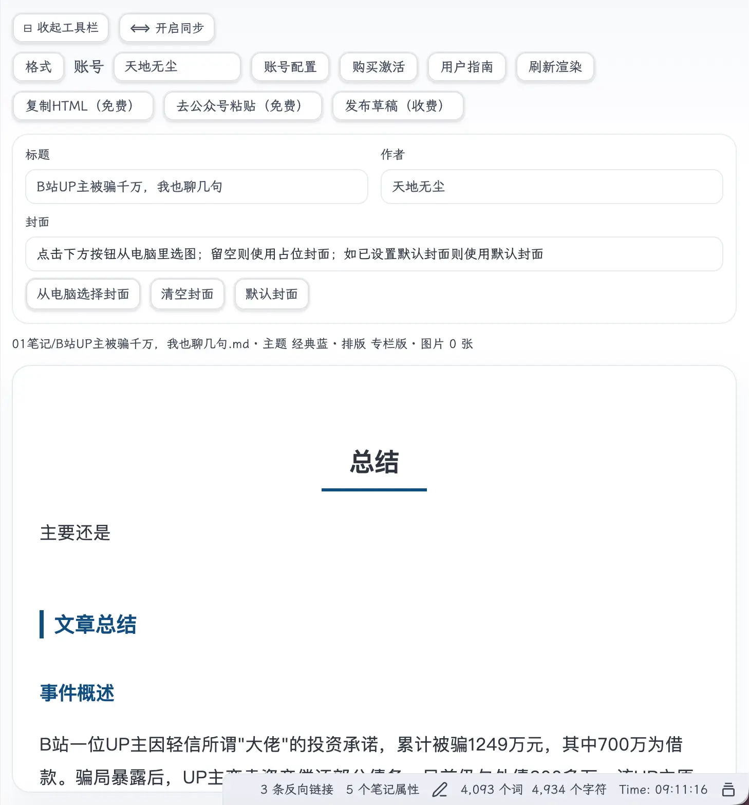
Two rows of toolbars, 9 buttons crammed into one row. Format, account, preset account name, account config, purchase activation, user guide, refresh render, copy HTML, paste to WeChat Official Account, publish draft… all piled up in the most prominent spot.
All the features are there, but it’s exhausting just to look at.
Below that, there’s a super long prompt: ‘Click the button below to select an image from your computer; leave blank to use a placeholder cover; if a default cover is set, use the default cover.’ A friend saw it and said, ‘Who is this for? A database field description?’
So when I saw Claude Design come out, I tried it right away. Let’s see how it actually performed.
How to Use
First, open the Claude web version, click Design on the left to enter. At the top, there’s an input box called ‘New prototype’, just fill in the project name.
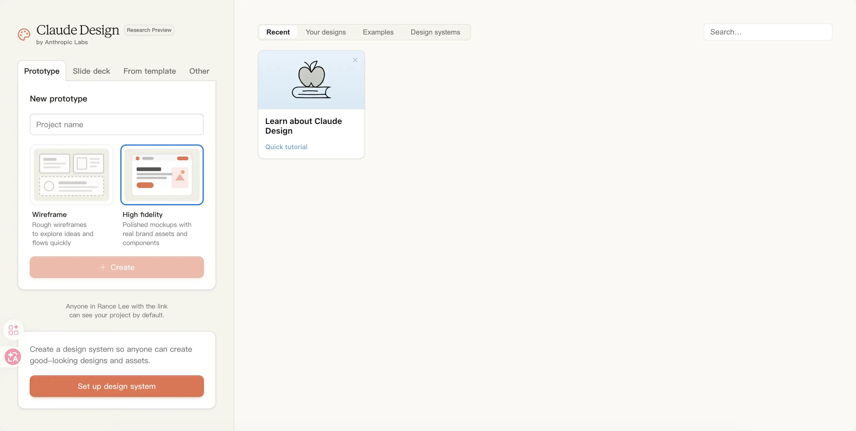
You can choose Wireframe (low-fidelity) or High fidelity (high-fidelity with brand assets). I chose low-fidelity because at the start it’s just about rough concepts, no need for high-fidelity. Actually, after you finish, it will automatically upgrade for you.
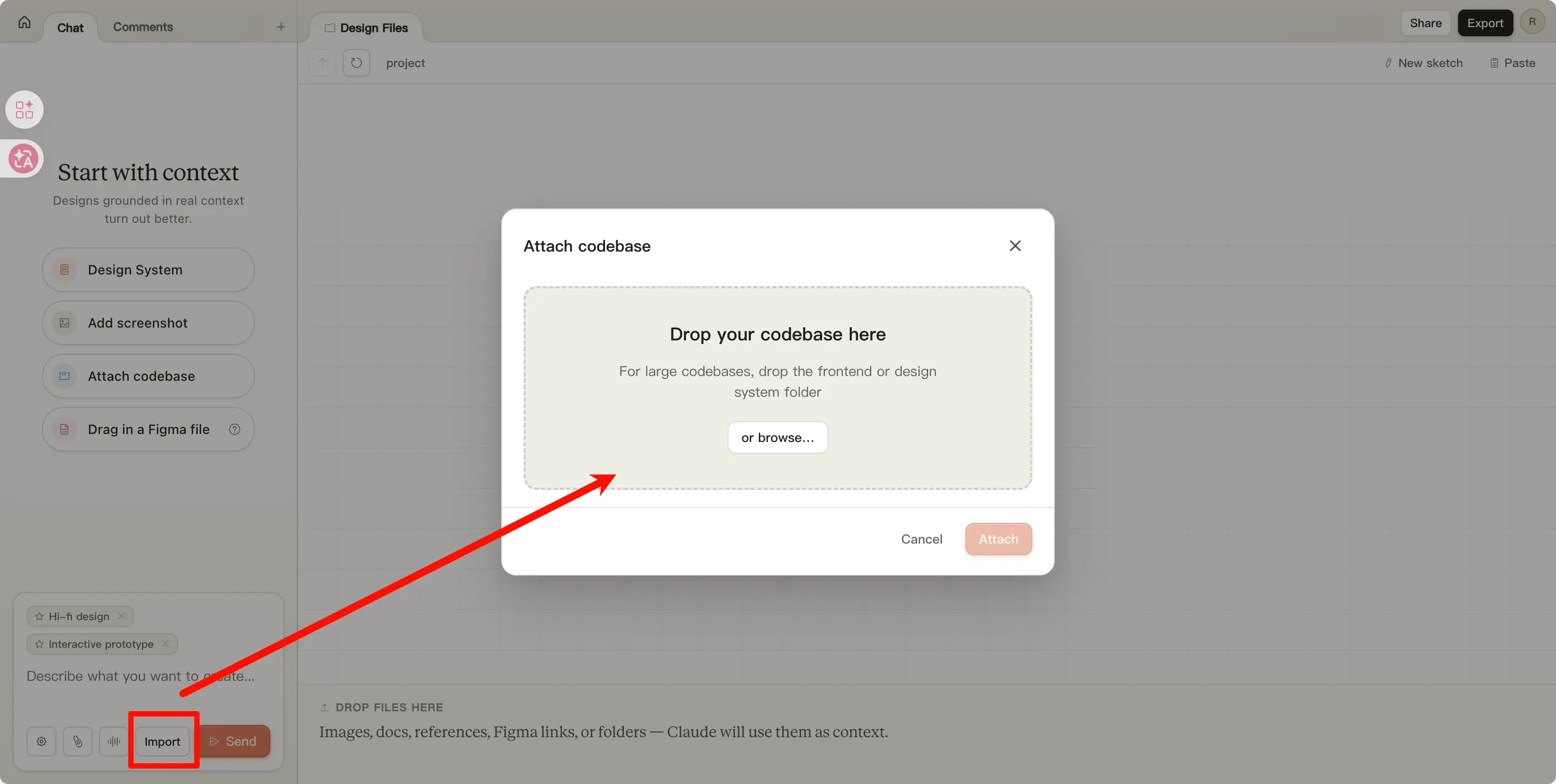
Next, tell it the program folder path, and send it a screenshot of the page you want to modify.
It will first ask you a few questions: what to change, what to keep, what’s the primary action, what’s the secondary action. I confessed honestly—I most wanted to highlight ‘Publish Draft’ and ‘Switch Account’, the rest can be collapsed.
After asking, it started running on its own.
It Came Up with 4 Options
Soon after, it handed me a wireframes.html comparison page.
The first thing was a comparison—it listed the ‘sins’ of my current UI one by one in red text:
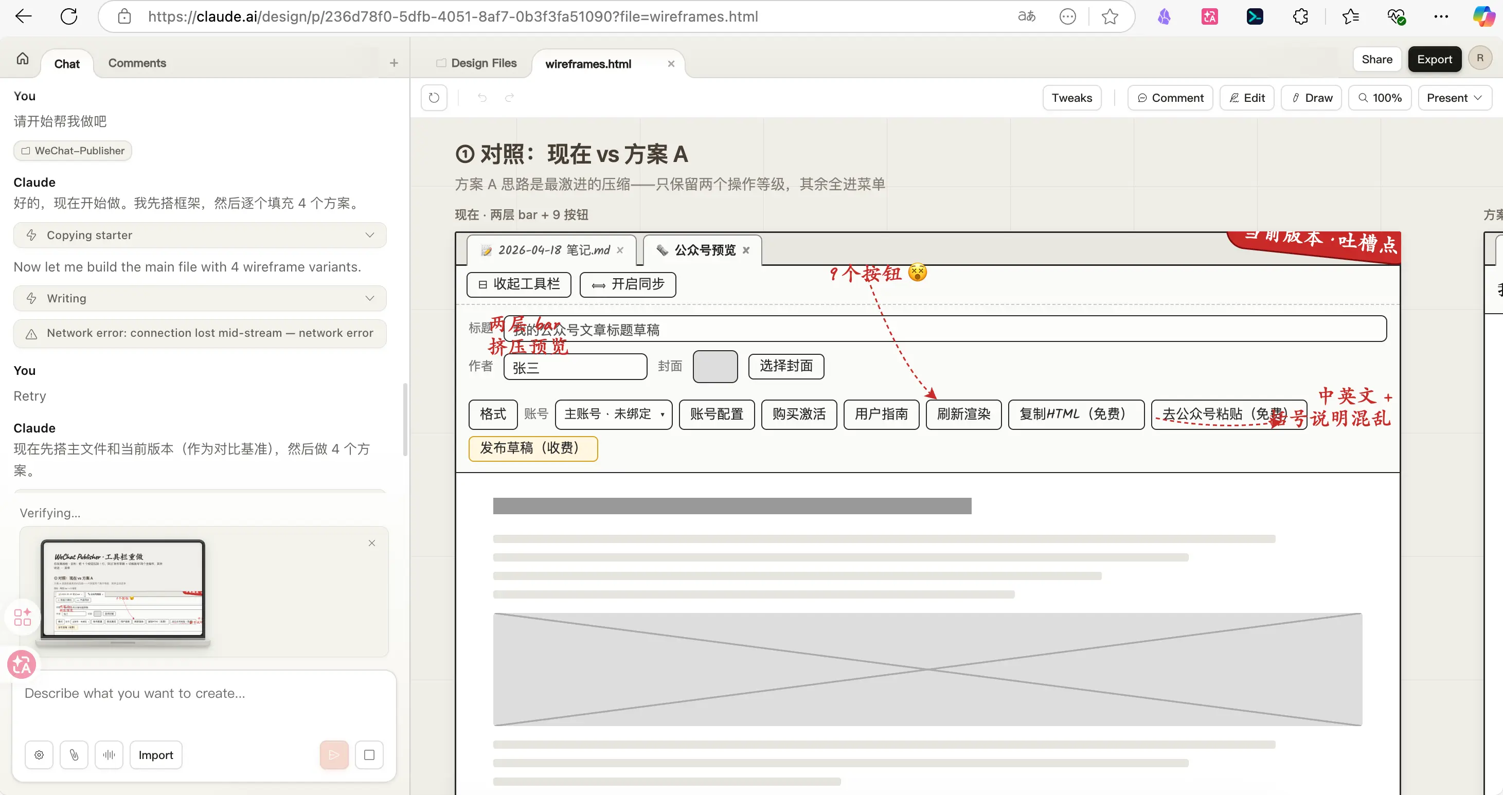
- ‘Two rows of bars squeezing the preview’
- ‘9 buttons’
- ‘Mixed Chinese/English + confusing symbol descriptions’
This feature really surprised me. I thought it would just help me modify things, but it actually saw the content and pointed out the problems. It felt like a real designer communicating face-to-face, not a cold AI.
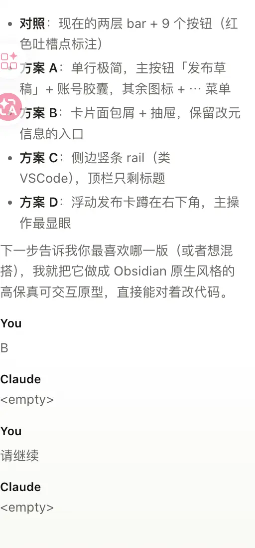
Then came the 4 options:
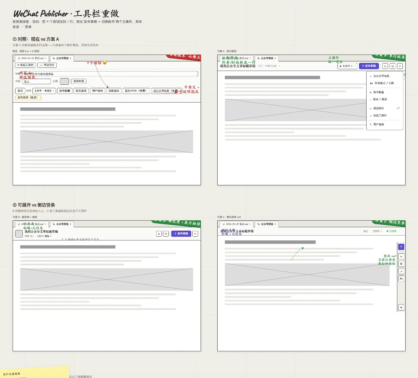
- Option A: Single row minimal, main button ‘Publish Draft’ + account capsule, rest icons +
⋯menu - Option B: Card breadcrumb + drawer, keep entry for editing meta info
- Option C: Side rail (like VSCode), top bar only title
- Option D: Floating publish card in bottom right, primary action most prominent
The most interesting was Option D. It drew a sticky note with ‘Common Design Rules’ and ‘Recommended Order’:
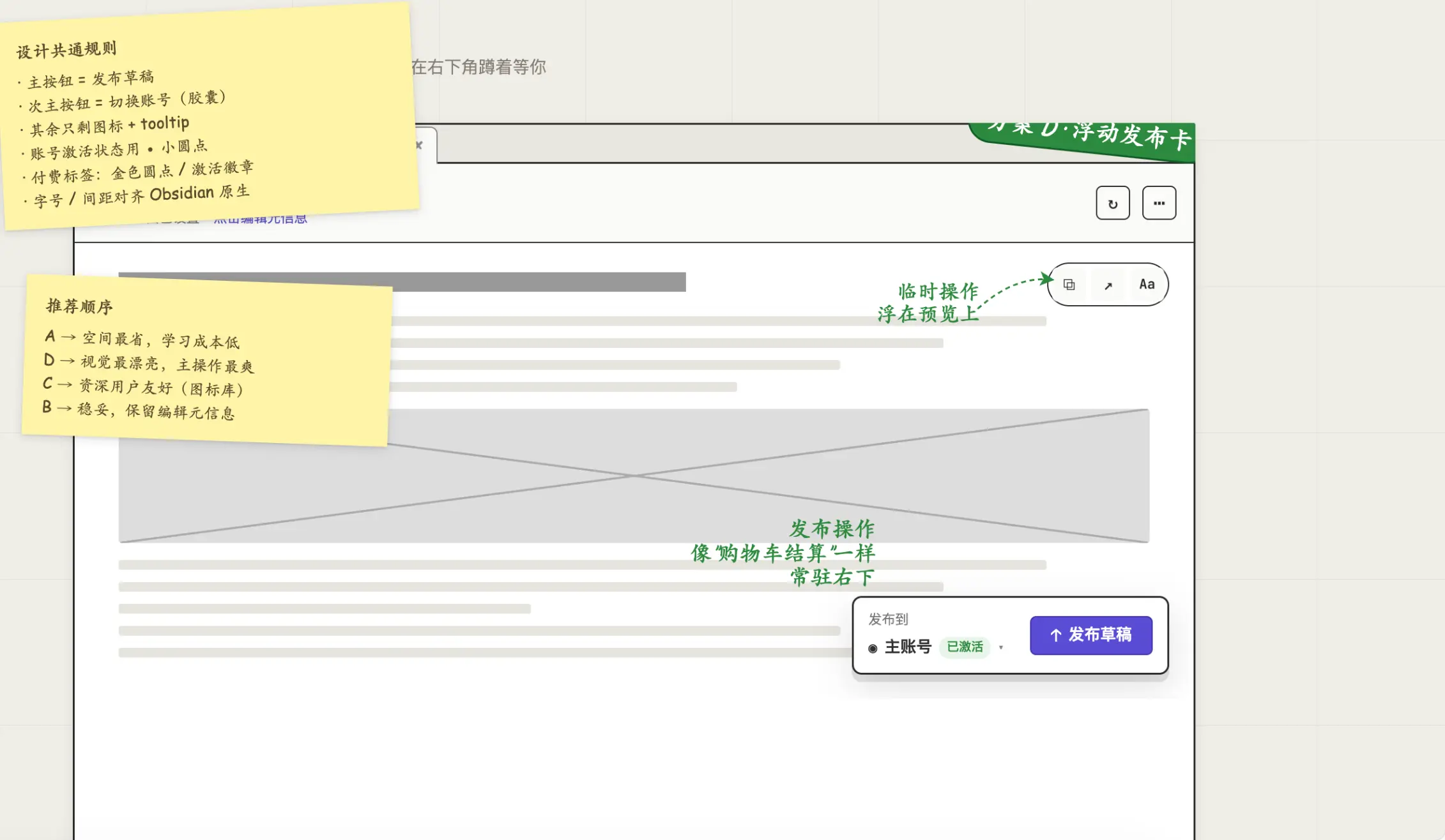
A → Most space-saving, low learning cost D → Visually prettiest, most satisfying primary action C → Friendly for power users (icon library) B → Safe, retains editing meta info
This isn’t just ‘here are some options’, it’s ‘here are some options + telling you who each is for’. I’ve been making plugins for a long time, and no one has ever seriously told me ‘where this button should go’.
You Can Keep Iterating
After choosing a direction, you can keep communicating. On the left is a chat box, on the right click Edit to directly select elements and modify (but the settings there were too professional, I couldn’t understand them, so I skipped it). Click Draw to draw circles and arrows on the preview and tell it ‘I want to move this here’:
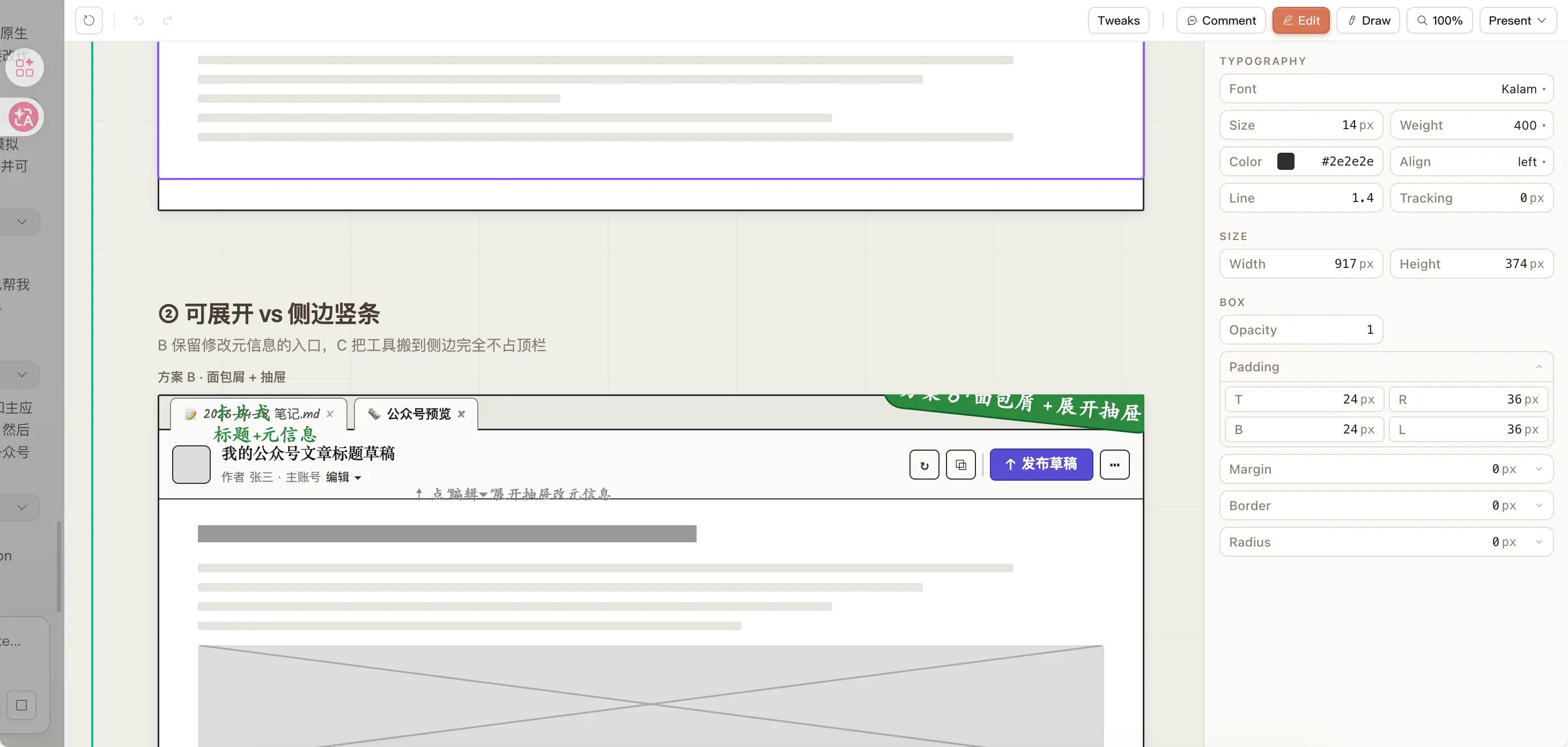
I think the Draw feature is amazing. I drew a very rough arrow from a button to the bottom right, and it actually understood—probably related to the big upgrade in Opus 4.7’s visual recognition (as mentioned earlier, it increased image recognition precision to 3.75 megapixels).
From Toolbar to Layout
After modifying the menu bar, I asked it to create several article layout styles—after all, my plugin’s main job is to format Markdown into something publishable on WeChat Official Accounts.
It opened a new page with the title ‘Format Markdown into a WeChat article worth reading’. In the top right, there’s a Tweaks button that, when clicked, lets you adjust font size, weight, color, line spacing, etc., just like Figma:
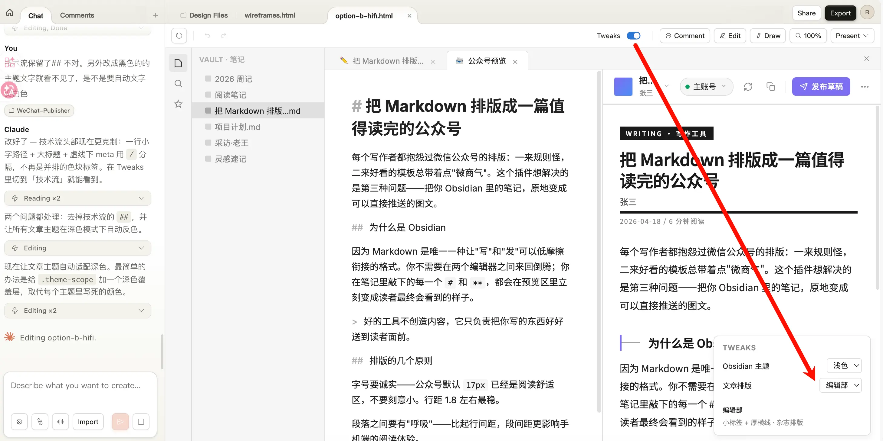
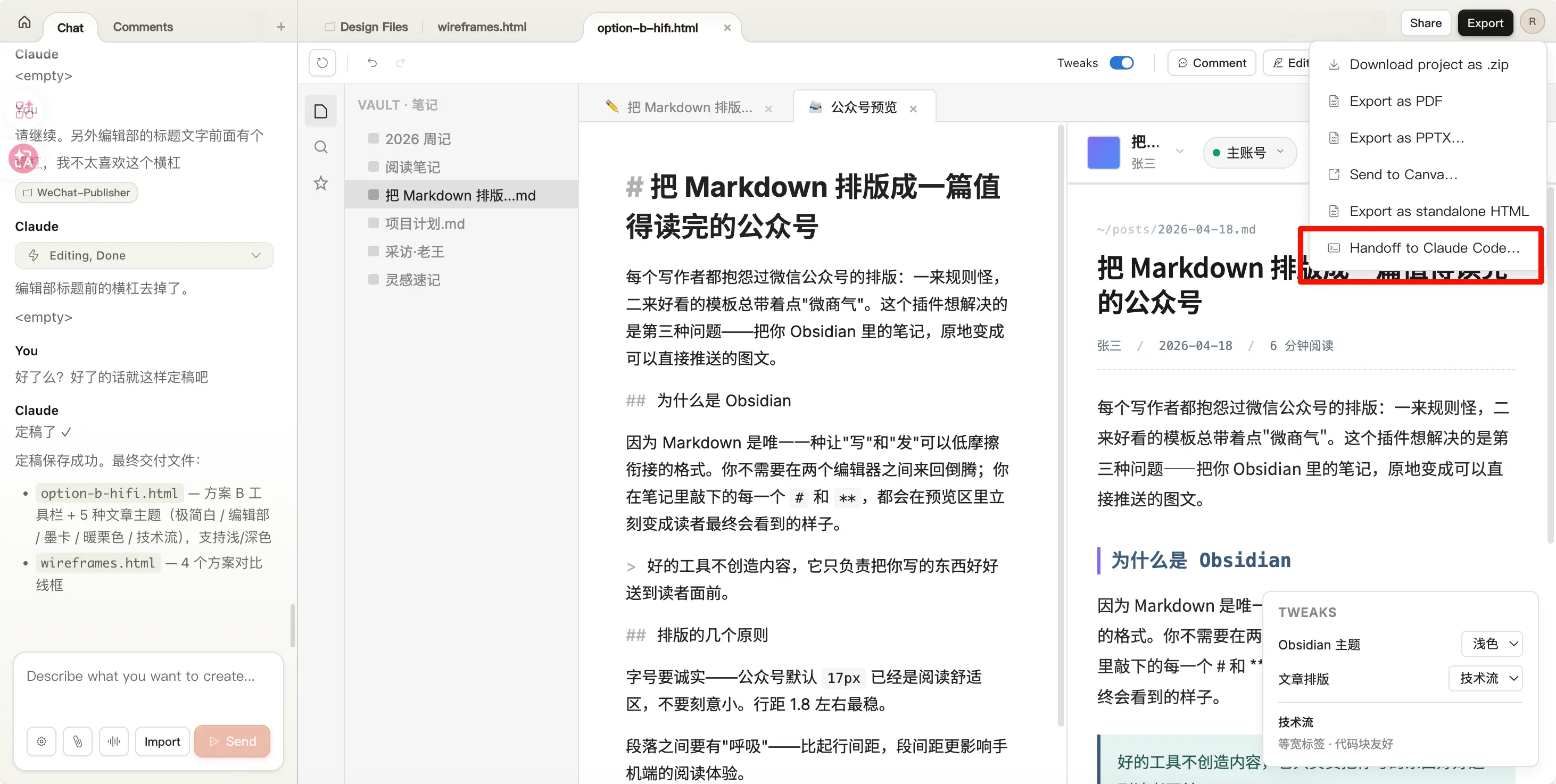
Note that this is a truly clickable and switchable page, not a fake one. This interaction is much better than doing it in Claude Code on the terminal. With Claude Code, you have to wait for it to finish to see the effect, then ask it to modify. Here, you get real-time preview.
After finalizing, click Export in the top right. It gives several options: download PPT, export PDF, export standalone HTML, or—the last one—‘Handoff to Claude Code’, which sends the entire design file to local Claude Code to continue coding.
This is the best part of the whole chain.
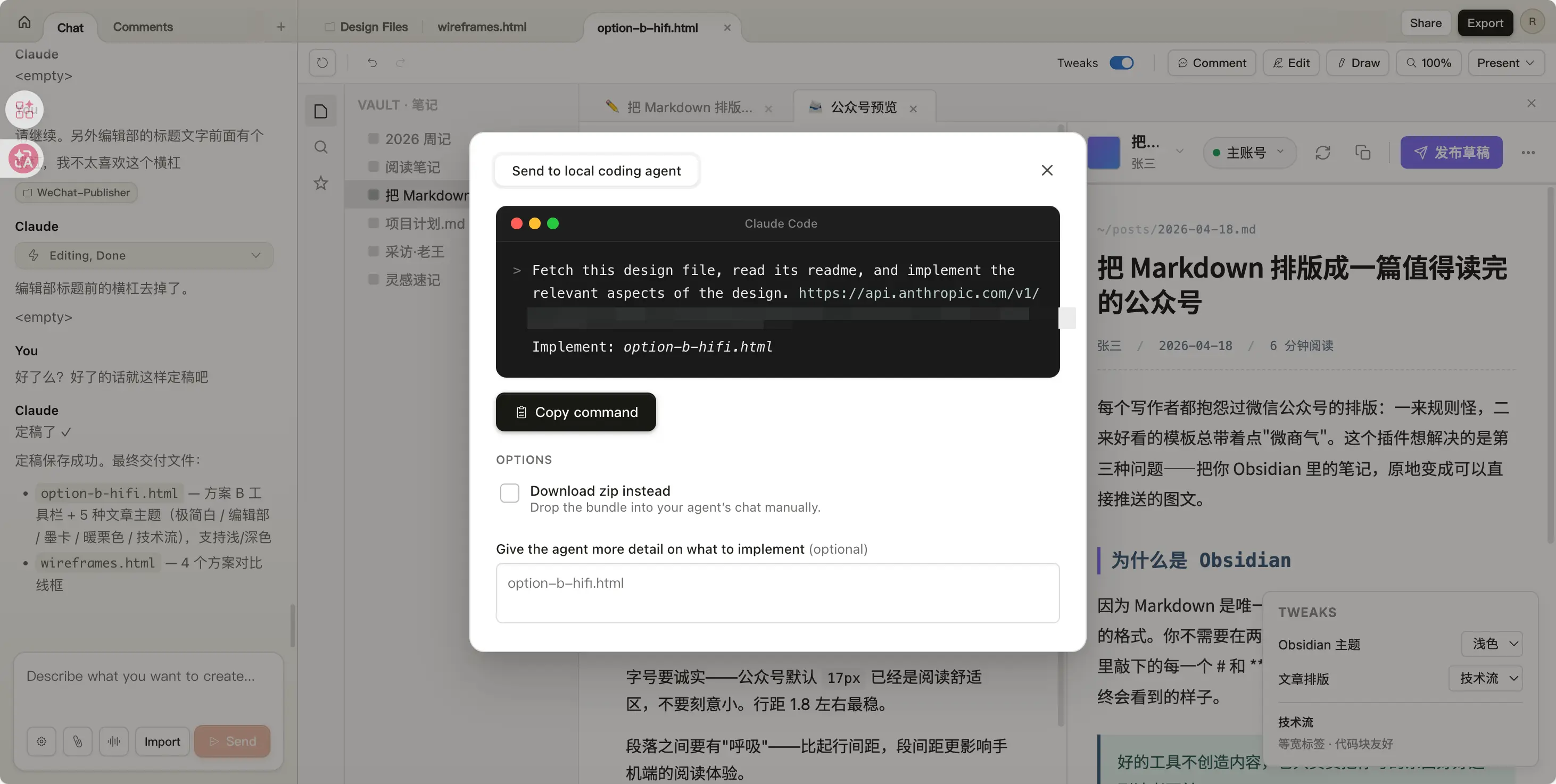
After designing on the web, it generates a command for you. Copy and paste it into the terminal, and local Claude Code takes over:
> Fetch this design file, read its readme,
  and implement the relevant aspects of the design.
  Implement: option-b-hifi.html
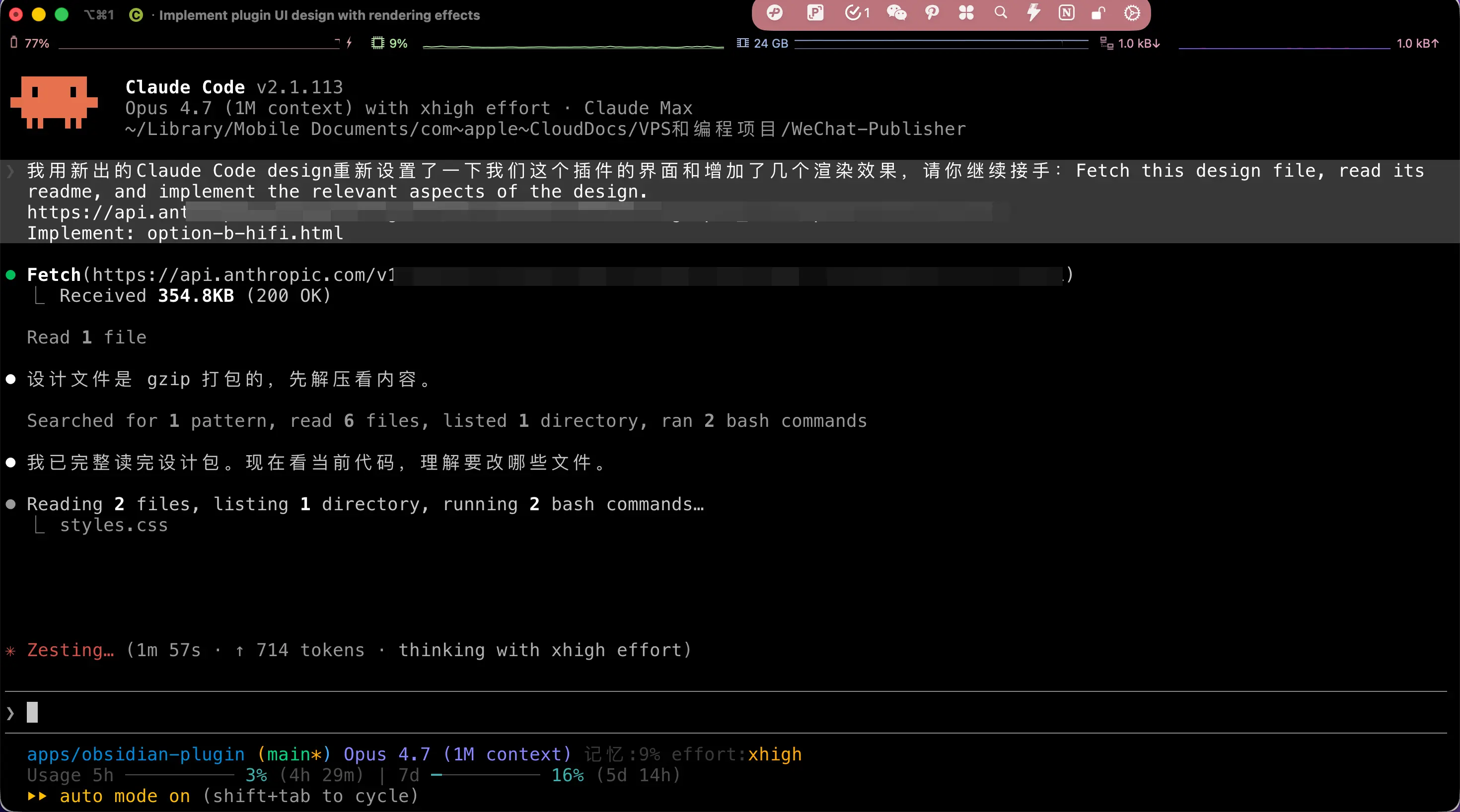
Then it starts reading the design package, looking at the current code, understanding which files to modify, and finally directly changes all my plugin source code. The design page provided option-b-hifi.html (I ended up choosing the high-fidelity version of Option B), and Claude Code reads colors, font sizes, spacing from the design file and applies them to my React code.
I didn’t write a single line of code throughout the entire process.
The Final Result
Anyway, I think it looks much better than my original. Although a real designer might have done even better, for a personal plugin, it’s more than enough (compared to my original design).
Title + meta info collapsed into one row, account becomes a capsule (with a green active dot), the primary action is just a single purple ‘Publish Draft’ button on the right, everything else is tucked into the ⋯ menu.
It turns out my pile of ‘features’ wasn’t lacking design sense—it was that no one helped me make trade-offs.
Adding a button is easy, but removing one from the UI is counterintuitive for a developer—you always think ‘what if someone needs it?’. But a designer will make that decision for you: ‘Put this in a secondary menu, users won’t click it again after the first time.’
This time, Claude Design made that decision for me.
The Cost
It’s Resource-Intensive
In Claude’s subscription plans, Design has its own quota (I have to say, Claude’s separate quotas are really piling up).
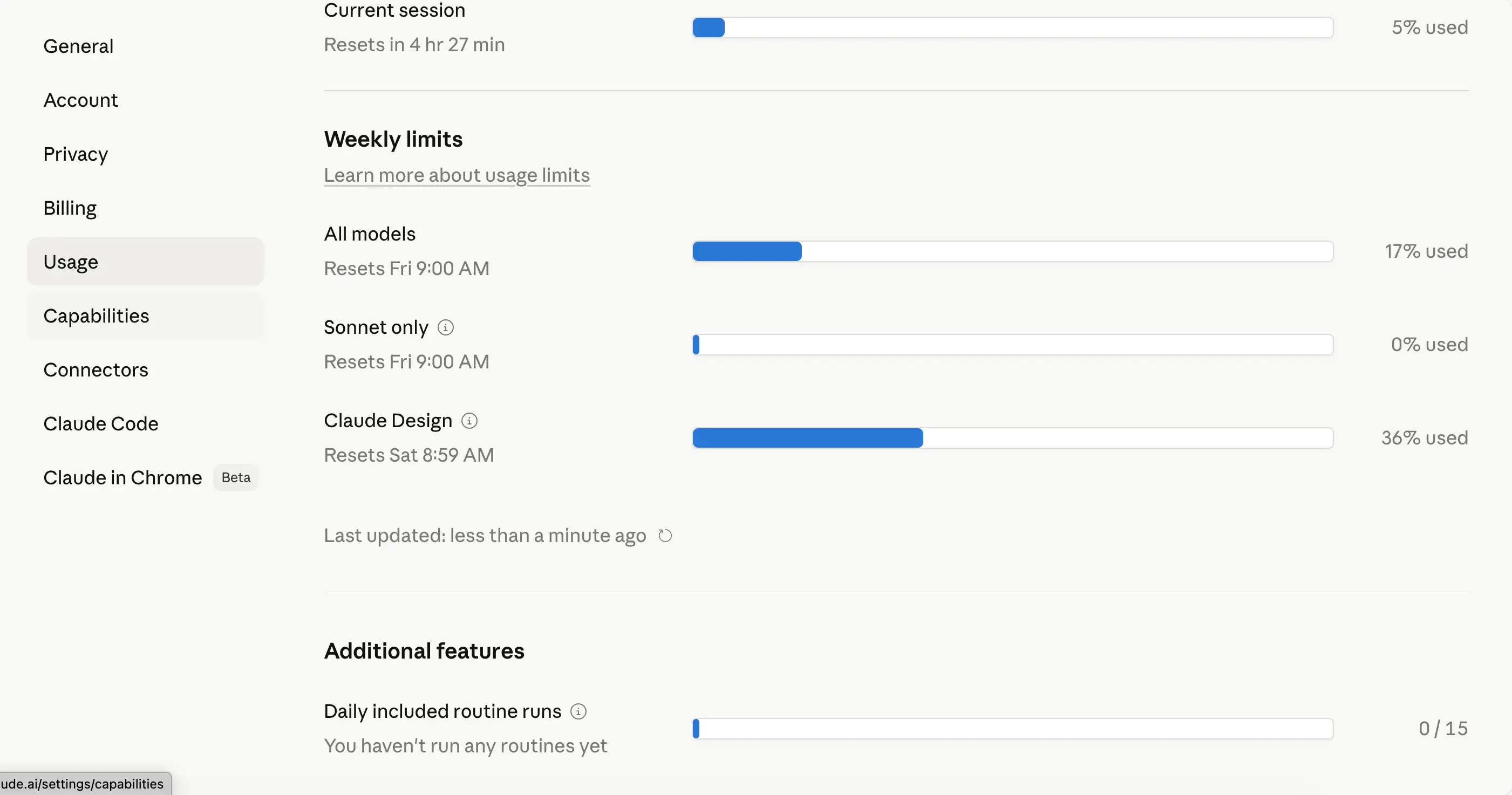
Doing this set—4 option comparisons + 5 article themes + high-fidelity implementation—consumed 36% of my daily quota. I have a 5x Max account; for a Pro account, that would blow through the entire day’s quota.
A friend of mine has a Pro account. Last night, he used Design to make a 30-page PPT and his daily quota was completely drained.
Occasional Glitches
Sometimes in the middle of working, you might encounter a situation: you send a message, and it replies with <empty>. Send again, still <empty>:
The fix is to refresh the page and tell it ‘please continue’, and it usually picks up. But you lose a bit of context. If you’re in the middle of critical design iterations, remember to take screenshots as backups every so often, so you don’t have to start over if it breaks at the last step.
Final Thoughts
My Obsidian plugin with its basic design finally looks like a proper product.
But to be honest, when I sat in front of my computer and clicked ‘Publish Draft’, I wasn’t entirely excited. I’m very clear about one thing—if someone like me with no design training can make a decent UI in two hours, then those who make a living off ‘decent’ are going to have a tough couple of years.
I used to worry that AI would make writers lose a conversation partner with literary taste. This time it’s the opposite—designers are about to lose the thickest part of the market: the beginner to intermediate range.
Every time AI takes a step forward, some people cheer, and some people quietly leave. This time I’m the one cheering, but I can hear that sigh behind me.
I’ve recently spent a lot of time and money on AI, worried that one day it might replace me, but so far I haven’t found a way out. It helps with my day job, but no fundamental change. Most importantly, I haven’t made money from it.
If you also have a small product, plugin, or website gathering dust like mine—go try Claude Design.
It might not get you your first sale, but at least it will make it look more presentable. And that, in itself, is a huge improvement.